Monday

The Blossom Challenge Winner!


Happy Monday friends!  It’s Christine and I’m popping in to celebrate the winner of our most recent The Blossom Challenge: Sponge Bath.  Random.org picked #3 which is Susan!  Susan has a gorgeous Trout card on an awesome background that you should definitely check out!  

Susan just pop March an email at bloom@powerpoppy.com and she’ll get your prize code out to you.  Happy shopping!


And in a Power Poppy update, I’m taking a hiatus from hosting The Blossom Challenge, but I hope to catch up with you creatively on my blog or Instagram .  Happy creating!  

The Blossom Challenge: Sponge Bath!


Hi Power Poppy fans!  It’s Christine bringing you another fun "The Blossom Challenge” for the month.  I’m feeling especially Springy this month, and ready for all the fun colour that’s soon to come.  So, this month’s Challenge has the theme “Sponge Bath”, and its all about using your sponging tools to bring smooth inky colour to your designs.  

I’ve got two cards to show you today that showcase different ways to sponge ink.  


First off is this beauty from Power Poppy called Spring Border One.  I adore this image and its sweet border style of blooms.  All the flowers are coloured with Copics, and I stamped the large tulip twice so I could add it to the left of the arrangement to balance out my how the flowers appear in front of the arched die cut windows.  


For my sponging technique I used a simple background technique, using Tumbled Glass Distress Oxide Ink on the card base, splattering it with water, and then splattering again with white ink.  Such an easy way to add a background to a scene.  It’s one of my favourite properties of Oxide ink, when you see how great it reacts to water.  


Perfect for a little note for a friend.  

Next I’ve used another gorgeous Spring image from Power Poppy called Daffodil Bouquet.  


For this design I utilized a stencil to create a backdrop for this amazing bouquet of daffodils and muscari (grape hyacinth).  Once my bouquet was coloured with Copics, I used some pale pink cardstock and a diamond stencil with soft shades of peachy pink (Tattered Rose, Victorian Velvet, Picked Raspberry and Seedless Preserves).  Using coloured cardstock and stencilling over top gives you a base colour that you don’t have to add with ink.  


I also lightly sponged the embossing of the die cut frame which allows it to tie in to the colour and accents the embossing slightly.  The sentiment is from Power Poppy’s Peony Muse polymer set. 
 

Those bright pops of colour really shine!  


Now WHO was our winner last month?  Random.org picked Camille (Short on Ideas)with her beautiful Black-Eyed Susans reimagined by the sea!  Camille, contact Marcy at bloom@powerpoppy.com  


Now we’re extending the Challenge to you!  It’s Sponge Bath time!  Use your sponges or blending tools to add inky colour to any part of your design.  You could simply distress the edges of your paper with ink, blend multi-colour or ombre backgrounds, or use stencils to create a background or layer to your design.  All you need to do is use at least one Power Poppy image to be included in the challenge.  

Link your entries below, you can play as many times as you like!  Challenge closes April 15 at 11 pm MTN. 

You are invited to the Inlinkz link party!

Click here to enter

Inspire Me Monday: Some Tips to Create in a Jiffy!


Hello everyone and happy Monday! It's time for another Inspire Me Monday and today, I have some fun, easy and relatively quick cards that I made to slip into the mail to send to my daughter at college. But, these little numbers are really all occasion cards that you could have on standby to send in a jiffy!

I started by going through some of my favorite digital stamps from Power Poppy and narrowing them down to images that would be "pick me ups" and happy illustrations. I decided on Wish You Luck, Asters Abuzz and Cuppa Buttercups

So how are these creations quick? I'll share some of the tips & tricks I used to keep it simple! 

First, I started by opening all of them up in my Photoshop Elements and putting them on a printable page just for ease and then, second, while they were all on the same page, I used different dies to cut out each image. 


Once I had my images die cut, I decided to make my card in reverse for ease. I call it backward but maybe this is how you create all the time? Let me know if you do because, honestly, it cut down on the time I normally take picking up and putting down so many different decorative card stocks until I settle on "just the right one!" For some reason, when the image isn't colored, it's easier to choose? Hhhhmmm.... maybe!

Oops! I almost forgot! With the Wish You Luck image, you'll notice the original has the stems included in the image and I wanted to create just a circle of clover -- so I opened up the image and then used the magic eraser to erase the tied stems! 

Here's a peek at the original illustration! 


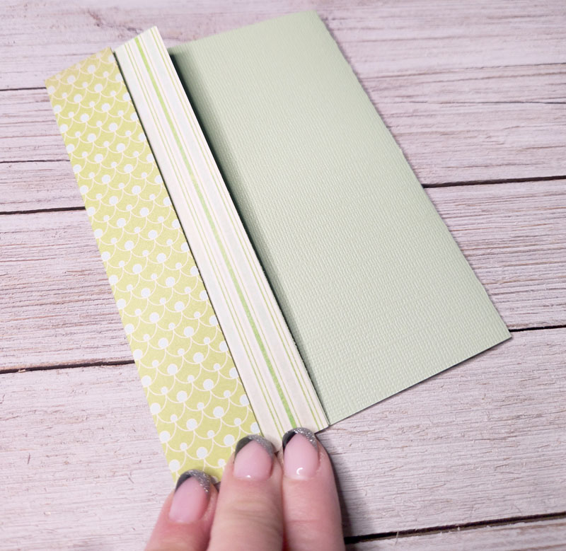
Okay, back to my tips and tricks! I went about creating my card bases before I even put marker to paper....


I created these three layouts in less than a half hour (and honestly, probably less time than that). I simply picked papers that looked appealing to me instead of trying to perfectly match them to the vibe or the color of the Copic markers that I used. 

Now, the reason why I wanted to do it this way was because my daughter plays college softball and since we can't always make the away games, we sit in front of our TV and watch her for doubleheaders on Saturday and Sunday afternoons. That's perfect coloring time in between innings! ;-) 


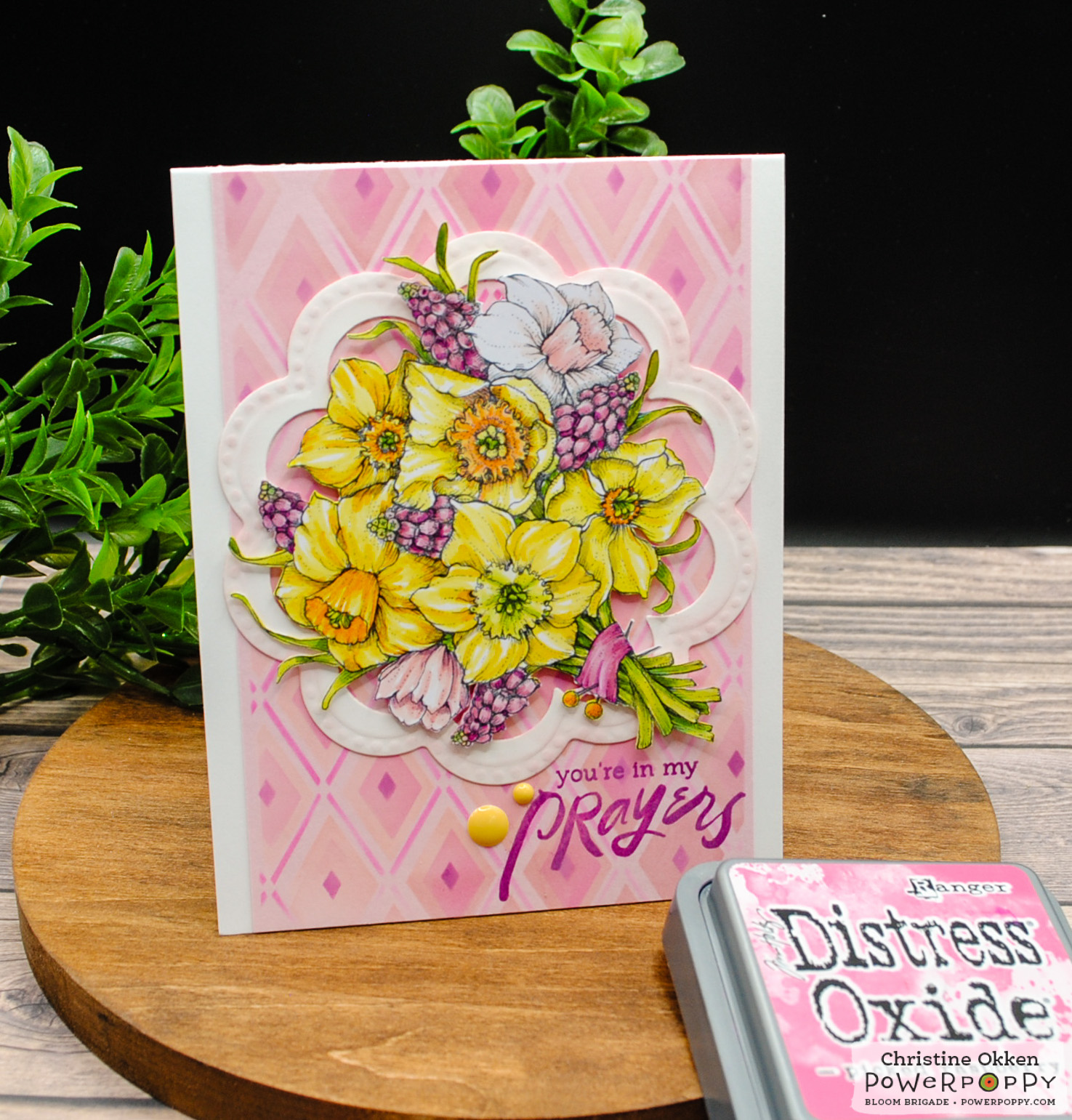
WISH YOU LUCK - Card #1

With midterms and finals always looming, I decided to use this image to pop in the mail when she needs a little encouragement. As a nursing major, it seems like every test is "do or die" and so a little love from mom can't hurt, can it?


While this card might seem a little "loud"-- I think it's happy and the patterns are fresh and fun! Color up the image with Copic markers, add a sentiment strip and some bling and.... done! 

Here's a closeup for you! 


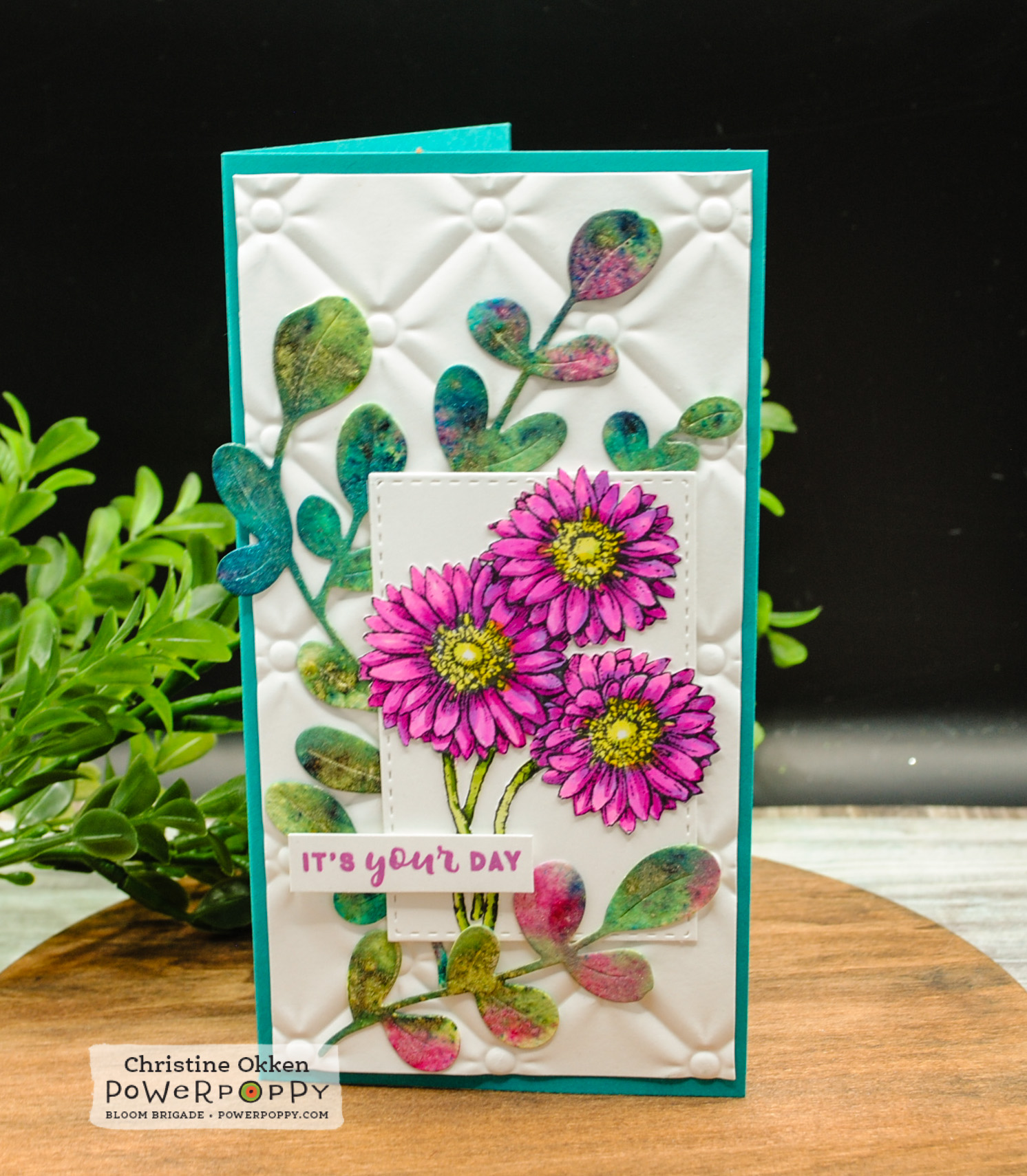
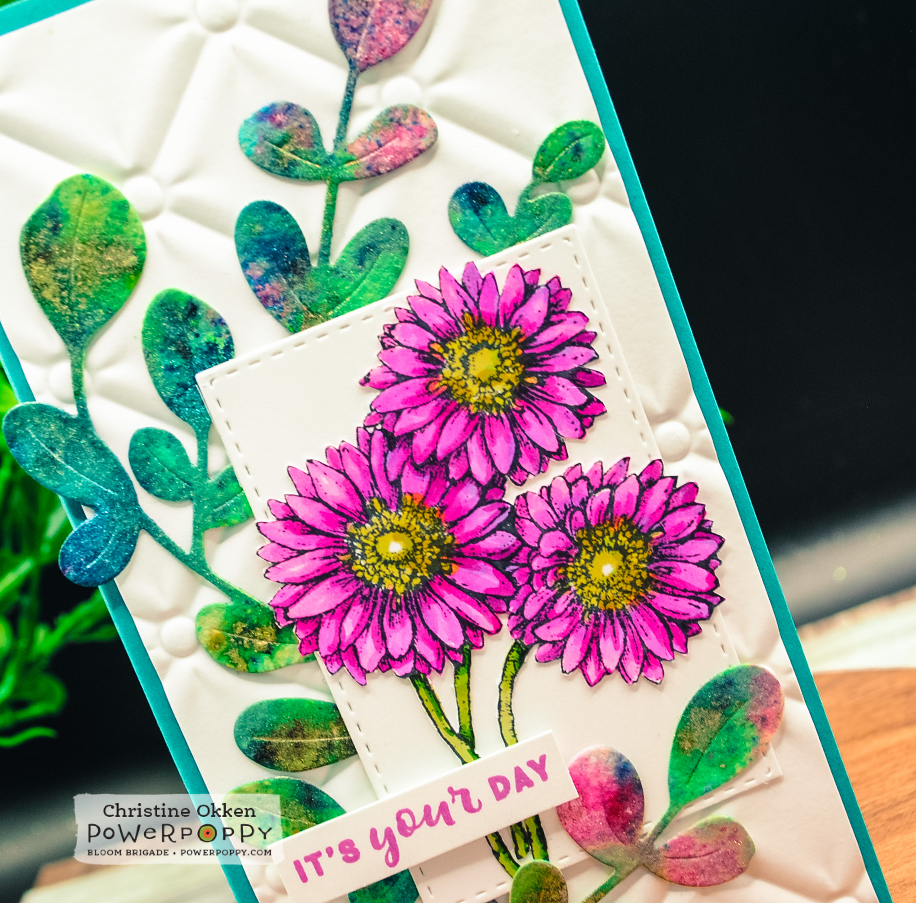
ASTERS ABUZZ - Card #2

This creation is just a little reminder to stay positive and when life gets you down, re-write the script and make your own happy. It's an important lesson, right? 


And, here's a little closeup! You can see that I did add a little sparkle to the bee's wings! 


CUPPA BUTTERCUPS - Card #3

I love this last card because you can pop a card like this in the mail any time for any reason! 


And so, after some coloring while watching softball, here's all three together! It was funny, after coloring an image, I'd run to my craft room and assemble and take a photo then run back to the couch to do it again! I have to say it was a fun way to create -- no stress or fussing at all like I normally do! :-)


I hope you had fun sharing a little time with me today and maybe you'll give these little tricks a try -- picking a handful of digital images and putting them on a page, die-cutting them in one fell swoop and then creating each card's layout before you color! It sure helped me! 

Thanks for stopping by! Have a fabulous and creative week! 


The Blossom Challenge: Inspired by the Sea

Welcome Power Poppy friends!  Today it’s Christine back with you, kicking off a brand new theme for The Blossom Challenge at Power Poppy!  

This month we have an Inspiration Challenge based on a photo from my recent trip to Northern California for work.  At a local friend’s recommendation we took a day off to head to the coast, driving through the Sonoma Valley wine country to a spot called Bodega Beach.  Its a sweet little coastal town with miles of beaches along the coastline.  It was such a stunning surprise with high cliffs, bluffs and pounding surf; you could believe you’re in Cornwall, England rather than the Cali coast.  The spot I took this picture was at Bodega Head where you are high on the bluffs looking down at the rugged coast above.  In the foreground you can see the vegetation with the pop of pink.  These plants are succulents called Sea Fig, and the flowers bloom a number of different colours.  Its an invasive plant in California, so they’re trying to control it, but it made for a beautiful picture!  

I’ve created two cards with this inspiration:  First up, a design inspired by the colours and plants in the photo.  


It’s a mini-slimline design using Power Poppy’s Gerbera Daisies Stamp set to mimic the flowers of the Sea Fig, colouring them in vivid pinks with my Copic Markers.  They are fussy cut and placed on a layered background with a die cut that I think imitates the sea fig vegetation.  A very FUN new find for me is the Lindy’s Magical Powders that I picked up which bring all the colour to that die cut!  These powders are dye based and activated in water, and result in gorgeous vibrant saturated colour and shimmer.  I think they really give the feel of the succulent vegetation and the colours of the sea.  


Here’s a view that helps you see how shimmery and shiny they are, and what awesome colour you are left with.  I’m going to be using them a lot in my future!  I’m using watercolour paper because it holds the moisture you need to activate the powders.  


The pretty little sentiment is from Power Poppy’s sentiment set, Nice Things to Say (in stock in polymer).  

Now I have a card that is very ocean forward.  


For this design I really took inspiration from the layout and colours in the picture.  I started with the background and used the same Lindy’s Magical Powders on watercolour paper to create sky, sea and ground with different powder colours, activited them with water and let them dry fully.  then I ran the background through an embossing folder I have that has the feel of the vegetation.  Next I brayered watered down white acrylic paint over the embossing to give the feeling of foamy waves and bring some highlight to the dimension of the embossing.  


For this beautiful sentiment I used one of my favourite Power Poppy sentiments M-Powering Words embossed it with a metallic embossing powder in teal, trimmed it out and placed it on teal glitter paper and a layer of vellum.  Then, I accented the card with pretty dies from The Greetery Curio Summer Findings. 


Now I’ll leave you with the photo without graphics, and I hope this inspiration has taken you on a lovely journey to the sea!  

Join us in The Blossom Challenge this month to create something based on any part of this photo that inspires you.  Be as creative as you’d like!  You could win a $20 Gift Code for the Power Poppy store!  
I’ve added the picture without the graphics so you can visualize all of it for your inspiration.   Link up your creation below!

The only requirements are that you need to use one Power Poppy image or sentiment, and can enter as often as you like.  This Challenge runs until March 18th!  

Want to know who won our Clean Slate Challenge last month? We had some really fun entries!  This month,  Almeslee with her gorgeous Birthday rose was our winner!  Almeslee please contact Marcy at bloom@powerpoppy.com to claim your winners code! 

             You are invited to the Inlinkz link party!

Inspire Me Monday: Valentine's Day Inspiration!


Hello all! And welcome to another edition of Inspire Me Monday.... albeit a little late today! ;-) Given that tomorrow is a day surrounded by love with Valentine's Day, I thought I'd share some old and new projects designed to help you share in the holiday in a jiffy! All of these projects are quick to create but not at all less heartfelt! So, let's get to it! Shall we? 

This first project is one I created a few years ago and is still one of my all-time faves. If you click the link, it will take you right to the tutorial! 

Sweets for your Sweetie! Create this darling box out of just a few strips of paper! Make it as large as you like or downsize it for some smaller goodies! The digital image is one of the best bangs for your Valentine buck with Va-Va-Valentines. This set features six different darling images and some small senties in one digital stamp set! What? Seriously? Yep. Seriously.  


Just Take 10! These two creations from Tosha Leyendekker only take ten minutes but don't look like they did! Since we are less than 24 hours away from this sweet holiday, why not try one of these? While this was stamped using a sentiment no longer available from Power Poppy, you could easily swap something in your Power Poppy stash like LaVie En Rose.


Speaking of La Vie En Rose, the last little digital delight I am going to show you a new creation that takes almost ZERO stamping! The only thing I stamped was the sentiment. I have to say this card was CASED from a kit that I subscribe to -- when I saw it, I immediately knew I could repeat the vibe using Power Poppy stamps. Whoop whoop! 

I started by downloading LaVie En Rose and removing the background with some of the tools in Photoshop Elements. I also found some royalty-free watercolor backgrounds that I knew would be fun to lay this rose over top. 


I added a stamped sentiment from an old Power Poppy set, add some silver cording, some sequins and Ta-Dah!! Fini! This is truly a 10-minute card! 

Well folks, since we are down to the last hours before Valentine's Day -- if you haven't gotten a card for your honey, try one of these 10-minute creations! 

Until next time,


The Blossom Challenge: Clean Slate


Welcome to a new year Power Poppy friends!  It’s Christine welcoming you today to start new year right with a new theme for The Blossom Challenge!  January brings a lot of new starts, maybe even new creative goodies and fresh creative juices, so we’re all about a Clean Slate this month!  So put away all the layers and extra do-dads and instead show us your best clean and simple designs that celebrate that simple, clean and yet graphic style that packs a punch! 

Today I pulled out a now retired polymer set from Power Poppy which showcases all sorts of fun mushrooms!  Parts of that set are also available in digi form as Mushroom Trio, Miraculous Mushrooms and Morel Standards.  I stamped this image on Kraft cardstock and then pulled out my Prismacolor Pencils because I always love how pencils look on Kraft.  


You can achieve a look that almost glows!  I always lay down a layer of white prismacolor for the rest of the colours to lay on and blend.   A simple snail die seemed like the perfect accent, and then a bit of ribbon adds another pop of colour but keeps it clean, and the layers very simple.  


Now you’re invited to come and join us for this month’s Clean Slate!  All you need to do is create a Clean and Simple design showcasing any Power Poppy image and link it up below to be in the running!  

BUT THERE’S MORE!  Did you know Marcy’s got a gorgeous freebie you can use too?!  Just in time for Valentine’s The Rose Digi is FREE!  It would be a beautiful clean design image to use!  But we’d love to see any of your creations.  

You have until February 17th to enter!  Winner will be chosen at random and will receive a $20 Gift Code to the Power Poppy store!  

You are invited to the Inlinkz link party!

Click here to enter

Inspire Me Monday: Fun Little Folds


Hey everybody! Welcome to another Inspire Me Monday! Today I have a fun little project for you that is a little non-standard but fits in a standard size envelope. Recently, I was surfing and someone created a card somewhat like this and it stuck in my head. Go figure, when I tried to get back to where that idea was, I couldn't find it, so these dimensions and how I created my card are probably a wee bit of my own making! ;-) When I find things like this, I love sharing with a Power Poppy spin on them! 

Here's a peek at the card we'll be making.... 


 You will start with a strip of paper that measures 5-1/2" by 12". This will be your card base, so be sure to use a kind of paper with enough bulk. You'll want to score this piece along the shortest width at the 6" line. 


From here, fold your piece, setting the fold along the 0" edge of your scoring device and score 4-1/4" to the right side of the fold. 


Now, flip your card 180 degrees so that the piece you just scored is now on your left-hand side. Now, again, to the right side of the fold, score at the 3-1/2" line. Once you've folded these pieces toward the middle of your card front, you'll have something that looks like this below. The inner fold is a valley fold and the outer fold is a mountain fold. 


I didn't want these flaps to protrude so much into my card, so I trimmed both flaps so that they were an inch in width. Now they lay nicely and don't take up too much of my card front. You'll see why this is important in a minute! 


From here, I cut two pieces of coordinating card stock to measure 1" by 5-1/2". 


I then adhered these two pieces to each of my two flaps. 


Before I finished the front, I wanted to make two pieces to serve as the inside of my card. I opened the digital stamp set Forget-Me-Not Heart in my Photoshop Elements and then changed the color of it to match my green paper. These pieces measure 3-3/4" by 5" and then 3" by 5". I wanted to have a nice amount of border around these pieces. The sentiment is from the polymer set called Chrysanthemum XL, which is retired. 


Now, with any folds like this, you know it's hard to close your card, so, that's why we create those fun belly bands on cards -- to keep everything in its place! :-)

And... that's what I did. I took a piece of paper that was 12" by 1-1/2" and folded it around my card, trimming off the excess and securing it in the back with double-sided tape. Some people choose to score this piece but I have never had any luck doing this with the proper measurements. My band is either too big or too small forcing bad words to come out of my mouth. So, instead, I lightly fold the strip around my card and follow up with a bone folder to make that edge crisp! 


From there, I printed off another Forget-Me-Not Heart, making it a wee bit smaller than the ones I used on the inside. Since I was using the blank heart portion of this set, I wanted a different sentiment and chose the one from the Camellias digital set "Life is Better with Friends." I colored it up with Copic markers and chose shades that would match my cardstock. My blue is a little bolder than the colors on my paper but I love how "cheery" it is! 


And, here's a little close-up for you! I did add a wee bit of glitter to the insides of my flowers. I can't resist. I just can't resist glitter! 


And that, my friends, is it! A fun little fold that keeps the person you give your card to guessing a wee bit! Not to mention, it's super fun and extra easy to make! If you end up making a version of this, please include a link in the comments! I'd love to see how yours turned out! 

Have a fun and creative week!